I got some questions about the tutorial yesterday and other random things.
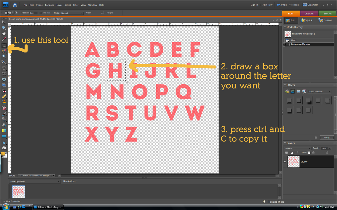
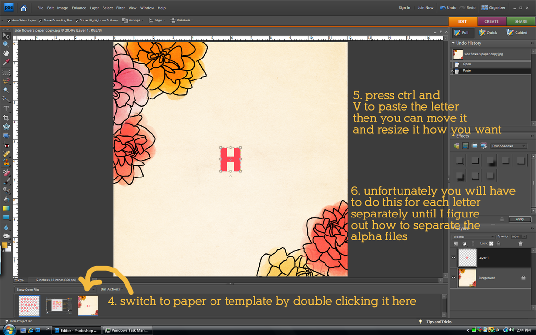
how do I use your alphas?
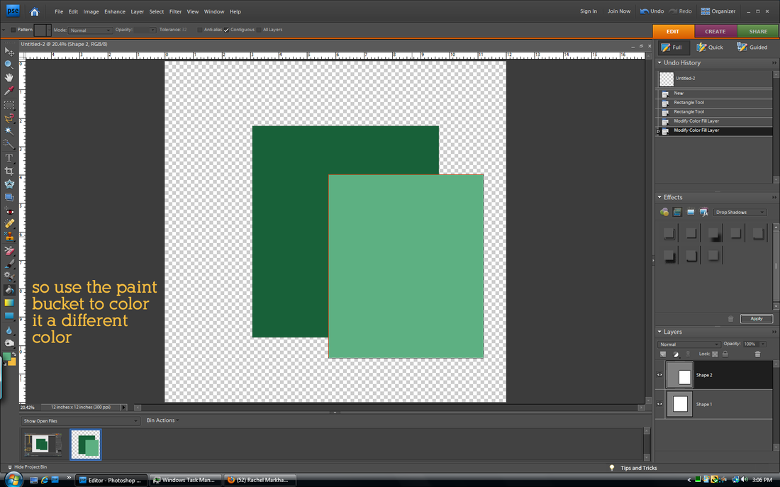
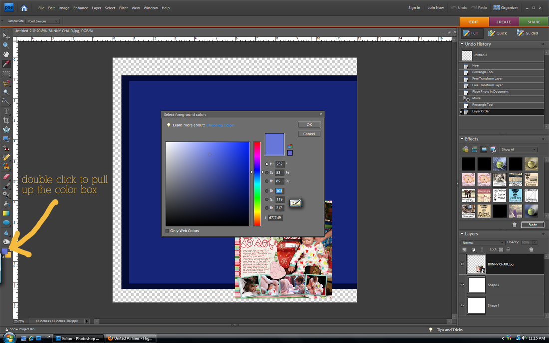
why do my shapes stay the same color instead of changing even though I used the color picker tool?
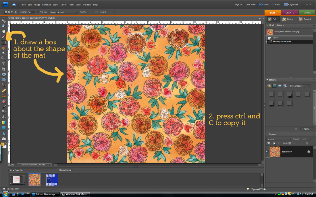
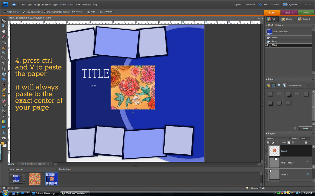
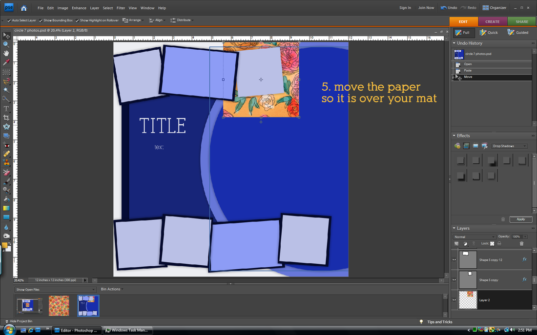
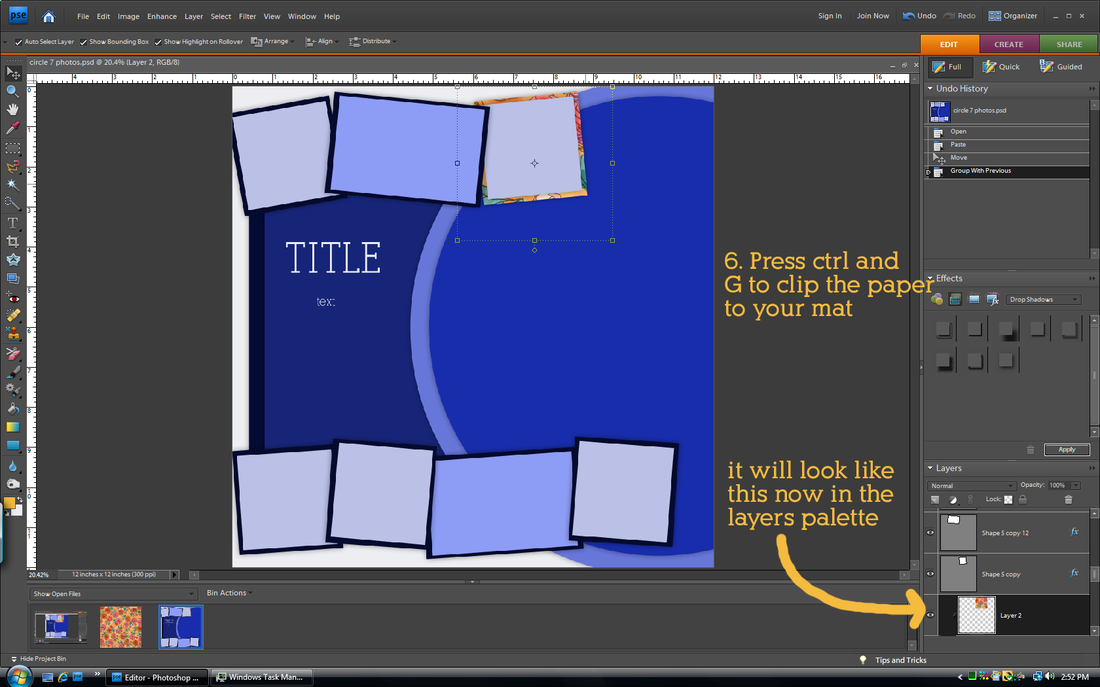
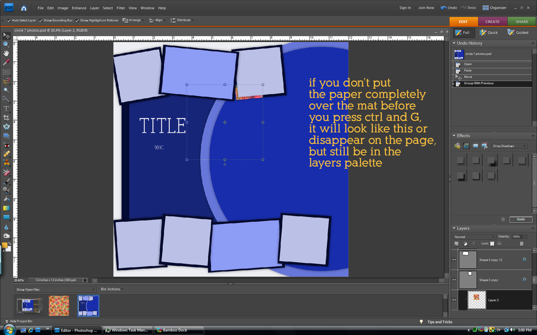
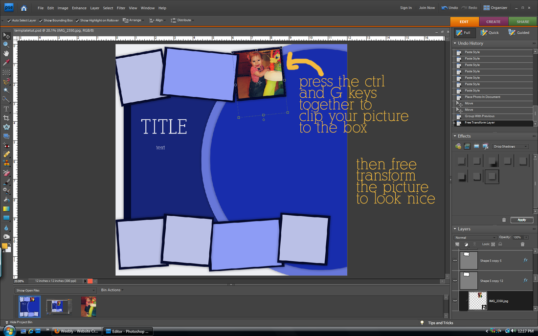
how do I get my paper to clip to my mat in the template I created?
This method will work for anything you want to clip to a shape in your template.
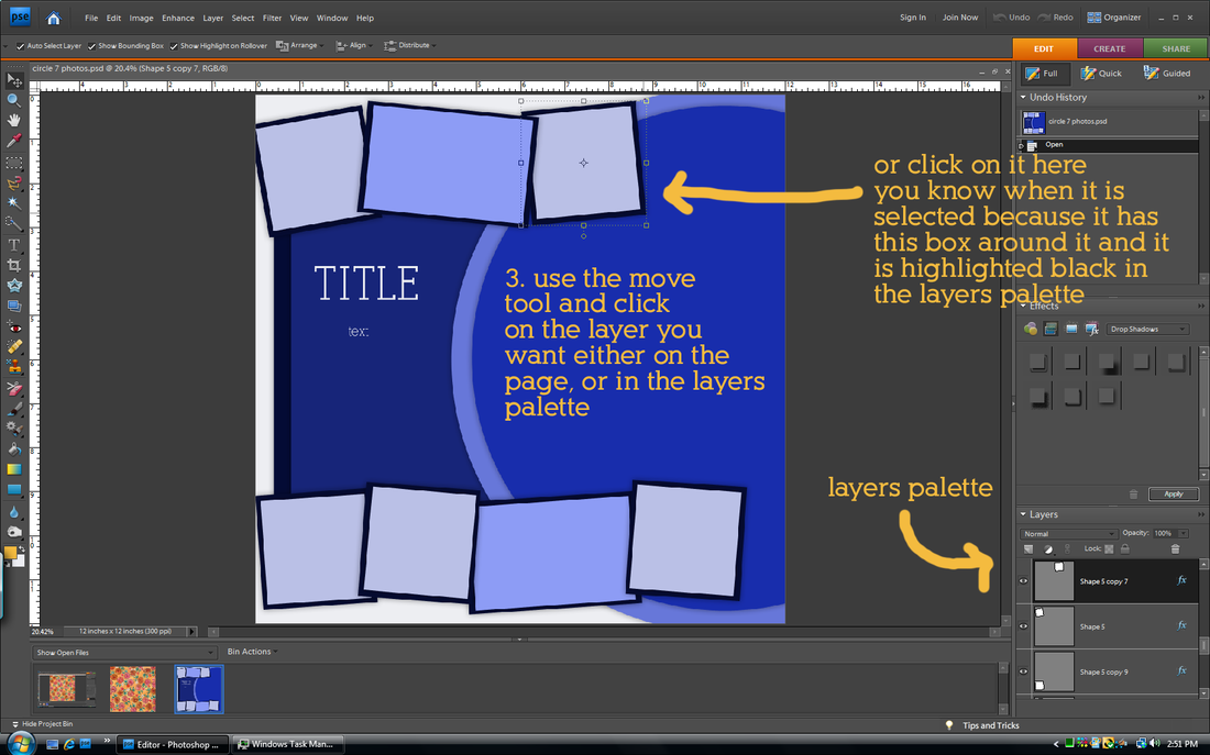
It's hard to see, but step three instructions is written in the blue part.
Hope that helps! As always, let me know if you have any other questions!
In my opinion, templates are the biggest money waster in all of digital scapbooking. First of all because most of them usually only showcase ONE or two pictures. Seriously? C'mon. (My ghetto students used to pronounce that as "see-mon") Who really only has one picture to scrap? Secondly, because they are so easy to make! Unless a layout is really fancy and includes shapes or other things I can't make myself, I choose to make my own. I learned that the hard way after doing the layout below.
layout by Cinzia Designs
|
layout using TBorges Other Colors of Christmas kit
|
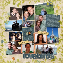
Hers is cute. Mine is so ugly that it is cringe-worthy. I hate it. Plus it took me hours and hours and hours to do. Should have just bought the template. But remember that this is the exception. In the tutorial below I will show you how I made my own template from the layout on the lower left for my page on the lower right.
layout by Cami a CT for Little Green Frog Designs
|
layout used Shabby Princess Sugarplum Dreams kit
|
how to create your own template
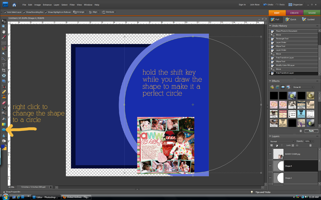
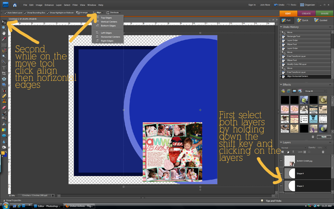
draw your background shapes
Change your shape colors as you go so that each layer is a different color. Otherwise they will all blend together.
The align and distribute tools are very cool. Especially when you are making a layout with boxes that need to be lined up right and spaced evenly. Play around with it.
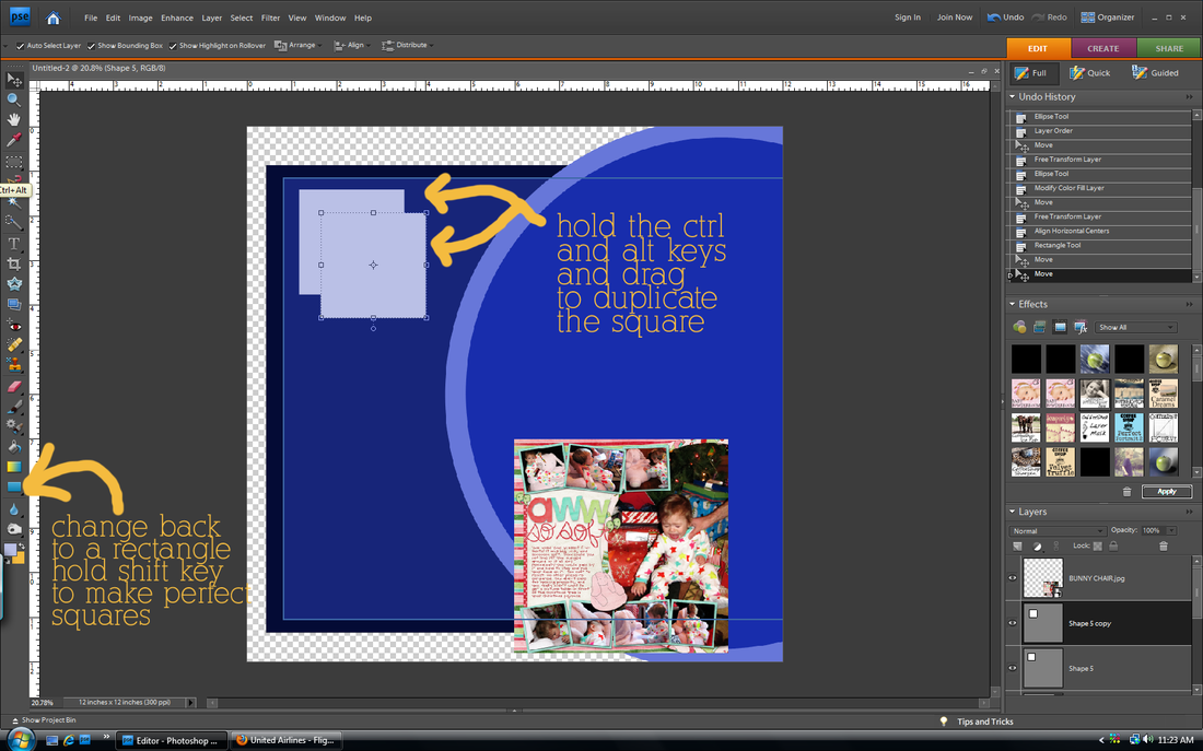
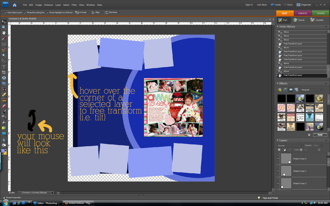
draw your photo shapes
That says hold ctrl and alt keys. Such a time saver!
add photo mats
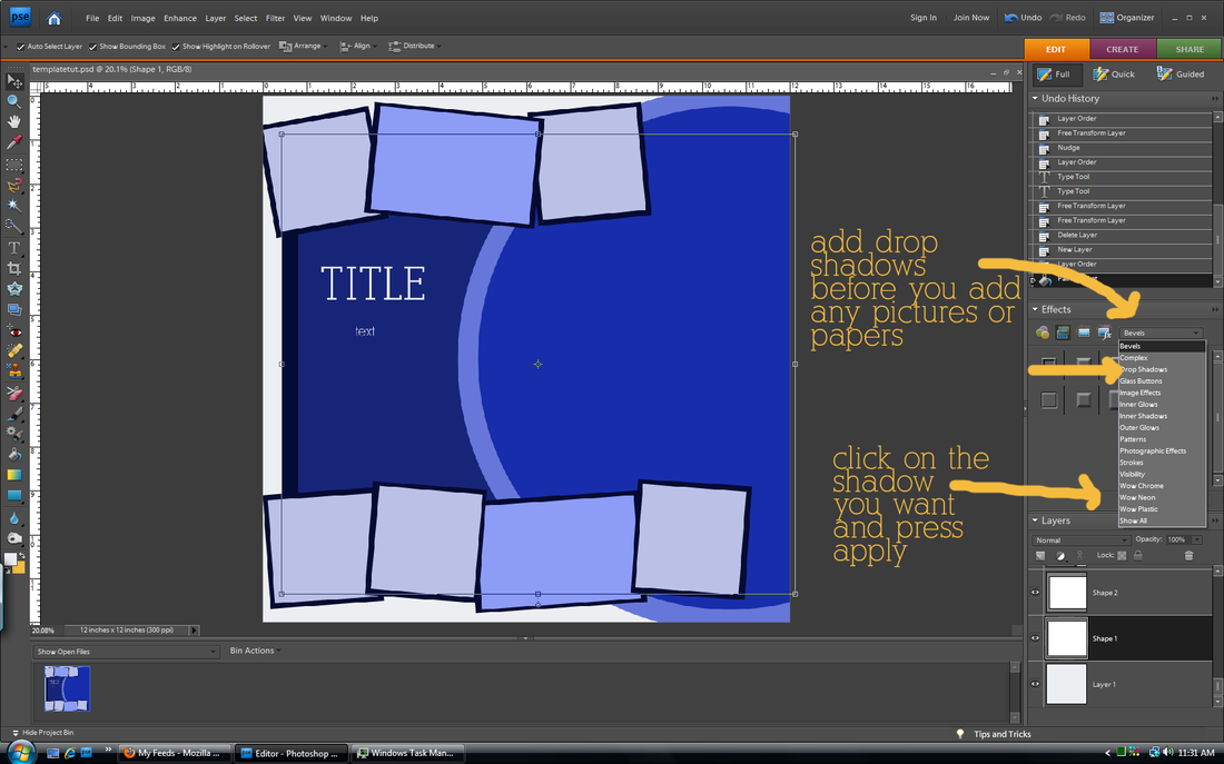
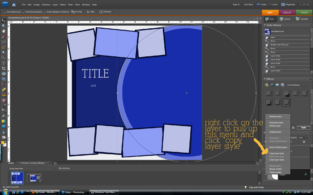
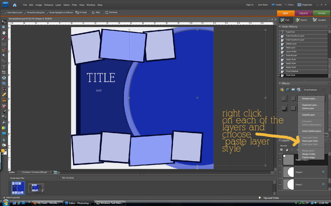
add drop shadows
The default drop shadows don't always look the best. Follow the above step to customize them.
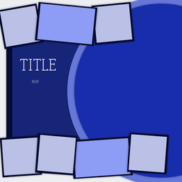
tada! template done!
SAVE!!!!! Then you can use this template over and over at the stage it is now, instead of when it has all of your pictures. You can alter it for another page, or use some of the shapes as a basis for another template you make later.
add your photos and papers
Continue clipping papers and photos to your shapes. Then you can add words, a title, and elements as you wish!
You will get faster. At first it may seem like it is not worth it to make your own, but eventually you will be a pro.
This is my first tutorial where I use the still screenshot. Let me know if it is confusing or if you have any questions!
My friend asked me a question over the weekend that applies to most--wait, scratch that--ALL scrappers. Do I start scrapbooking pictures from the beginning or just start now and go forward?
This is a hard question. When I started digital scrapbooking, I had 6 years of pictures to scrap (like dating my husband, trip to Europe, getting married) plus the pictures of events that were currently happening. I decided to start with the current pictures and move forward, my reasoning as follows:
1. Recent pictures were the most exciting because they had just happened
2. After a week, I have a hard time remembering people's names and details of events so trying to journal about events from 6 years ago would have been hopeless
...and...
3. Just thinking about scrapping the endless files of pictures from events and people I don't remember made me want to set fire to the computer and say, oops, all of the pictures are gone now...
So I just pretended that those pictures never existed. Actually, as I got faster at scrapbooking it was easier to catch up on current events so I had time to go back and scrap pictures from years ago. I am officially caught up now, but I cheated. Here's how you can too. (These rules are also the same for when you want to scrap something fast like you have a printing coupon that expires in two weeks)
rules for catch-up scrapping
scrap only the most important pictures
(or the ones where you look really cute)
I have lots of pictures from when we were dating. Not all of them are good. So I only choose the best ones or the ones that were most meaningful to me. When I say I am caught up, that doesn't mean I scrapped all of my pictures, some I just don't care for and that's okay.
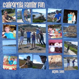
cram the pictures in!
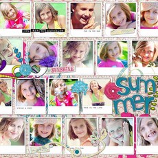
This layout makes me laugh, but I really just wanted to get this event scrapped. When catching up, put as many photos on as you can (you don't have to be as dramatic as this example, but please put more than 2 pictures on a page).
forget the journaling
Don't hurt your brain by trying to remember details. People really only want to look at pictures anyways.
ditch the elements and fancy stuff
Just choose a cute paper as the background, add the pictures, add a title and a date, then call it done. It won't be the cutest layout ever, but it will be done. Save the cute stuff for current pictures.
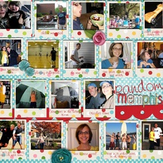
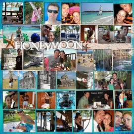
save (or pin) layouts with lots of photos I have a file for example layouts that I see online that use lots of photos. Then when I have time to do some catching up, I have lots of examples to choose from and copy. I don't have to waste time trying to figure out what I want it to look like. All of the examples from above (except the maniac honeymoon layout) were copies of layout ideas from someone else.
One of the best ways to catch up fast is to use templates. Come back tomorrow for a tutorial on how to create your own templates (and use them)!
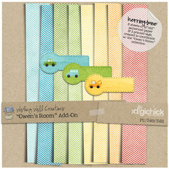
Nothing much cute out this Friday. No freebies, and I wasn't even inspired by the new products that came out today. Sad day. Well, earlier this week I did see the herringbone papers in fun colors on Wishing Well Creation's facebook page. Just like her shop to download it. Also, this isn't quite a freebie, but one of my all time favorite kits by one of my favorite designers is on sale this week for 40% off. I think I paid more for it. Find it here. Have a FANTASTIC weekend!
Ombre is everywhere now. At first I didn't like it, but now I'm seeing things that make me like this trend more and more (except for some listed below). I've been planning on doing this post for a while, and then last week Shabby Princess did a post on the same thing!!! Dang you idea-stealing Shabby Princess. Anyways, their article is good, find it here. If you don't know what ombre means, it is a shading of dark to light (or light to dark). And once you know what it is, you will see it everywhere. Just look at Pinterest or Anthropologie. As with all trends, moderation is key. There are two types: blocking of the colors and an actual shading of the colors like when dyeing something. I tend to like the first one the best, but that's just me. I'll illustrate with photos I pinned on my pinterest board (I promise to not hate you if you like some of the no's): yes!
 This is not moderate per se, but it still blends in the environment. And the colors are fabulous! yes, I want!
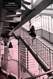
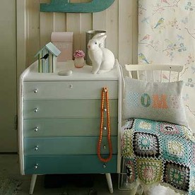 I love the dresser! I've also seen staircases that are tastefully done. Adds some flair, but still blends with everything else. | no!
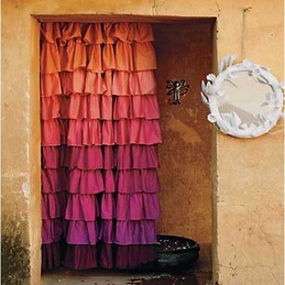
 I think this is too overpowering for a room. Interesting to note that both curtains are by Anthro. heck no!
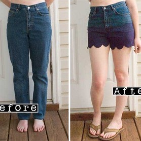 This was actually repinned by lots of people. I think it looks too hippy-ish. Ombre can look hippy so watch out when using it. Also, why the grandma jeans? |
ok
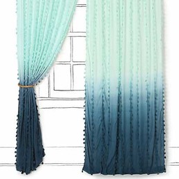
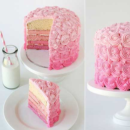 Too much ombre. Choose either ombre frosting or ombre inside. Both is overkill. | better
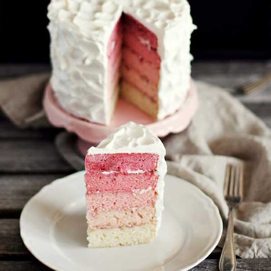 It's a normal cake, and then...surprise! Ombre inside. | best
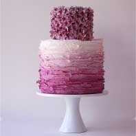 This takes the trend and makes it look classy and elegant, although I probably wouldn't choose mauve. |
Ombre can add some spice and trend to your scrapbooking layouts. In moderation. You don't want to look back on these pages and say, "those were so 2012." Here are some ways to add a little ombre flair to your layouts. Notice again that I said a little. Choose one thing--two or more types would be overkill.
With papers and elements...
 Love how subtle this is! She searched for blue papers and elements that matched, but you can do it faster by recoloring (and use any paper or element you want)! Check out my recoloring tutorial under the Tutorials tab.
...in the journaling...
 She did rainbow text, which isn't ombre, but you get the point. I think ombre journaling would be really cool. Find this layout here.
...as the background...
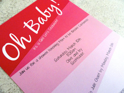 Use a bold ombre background paper, but remember to keep everything else (black and white photos, text, title) simple. Find this invite here.
...on the photo.
 If this were the only photo on the page and you were using a minimalist style layout, I think this could look fun. Find the tutorial here.
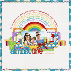
 Here's my attempt at ombre. The background paper used a little of it, so I stuck with an ombre black for the text to make it less ombre overkill. I used papers from my spring kit (coming soon) and Color Me Spring alpha found here. The font is Cicle. I would like to see the amazing ombre layouts you create! Email me to put your layouts in the Gallery (it can be ombre or not, I know everyone would love to browse your work for inspiration)!
I seriously did not know how to do this until last year (after scrapbooking for 4 years). It has saved my life. It is a good way to stretch your stash of scrapbooking supplies and get papers/elements/alphas to be the exact color that you want. And it's super easy.
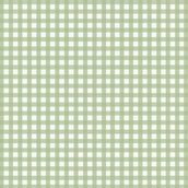
step one: 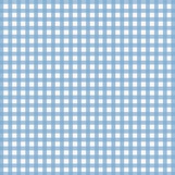 Open up your paper/alpha/element that you want to recolor. Make sure that it is the only layer open. I'm using the blue gingham paper from my farm kit.
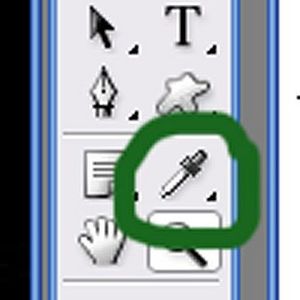
step two:  Use your the eyedropper tool to select the color you want. You can click on a color in a photo that will be on the page if you want it to match. The color you choose should be the foreground color (it will be automatically unless you do something weird between this step and the next one). I wanted a green gingham, but it wasn't included in the kit. So I picked green from another green paper included in the kit so it would fit the same color scheme.
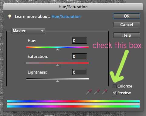
step three:  Open up your Hue/Saturation box (found in Elements by clicking on the half white/half black circle in the Layers palette or go to the Layers tab and click on New Adjustment Layer). Check the box that says "Colorize".
step four:
 Adjust the hue, saturation, and lightness sliders (they are in the same box as pictured above) until you get the look that you want. The hue will change the color (but you already picked your perfect color with the eyedropper tool), so I just play with the saturation (usually has to be increased) and the lightness sliders. Then click "OK". That's it!
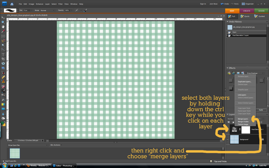
(updated) step five:
When you change the color, you create another layer called the Hue/Saturation layer. This will make it difficult when you move the paper to other pages, or copy and paste from the paper. To avoid problems with this, merge both layers together. Remember when you close the paper to save it as something different so you don't write over the original file!
You can do the same thing with papers with many colors on them, but the finished look isn't always the best because you can only recolor things to one color. The example below is with the animal words paper from my farm kit.
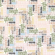 The original
| 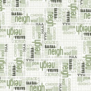 After colorizing
|
If my directions do not make sense, please ask questions!
The only way I will keep myself blogging regularly (for the two people who read this) is to have a theme for certain days. I'm thinking Monday Muse for inspiration on layouts, Trendy Tuesday for information on scrapbooking/design trends, Tutorial Thursday for tutorials, and Friday Freebie for free things (mine or others'). I won't do each every week, but it will help me organize what I want to share with y'all.
This week's Monday Muse is more design-y than cutesy, but I like both styles. Sometimes I get sick of the cutsey scrapbooking and want to try something new. I was inspired by these two images that I found last week.
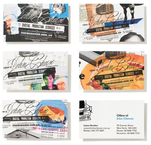 Business cards as seen on oh, hello friend. | 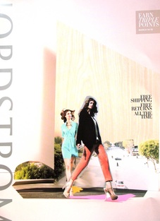 Nordstrom catalog |
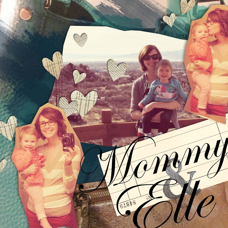
I miss doing collages. In the past, when I cut out people from images on photoshop, I usually spent a painstakingly L-O-N-G time cutting them out exactly. That's why I loved the chunky, imperfect cutout of the girls on the cover of the Nordstrom catalog (click on the image to make it bigger so you can see this). It is really easy to do with the polygonal lasso tool. The really nice part about doing a collage digitally is that if I cut out something wrong, I could undo and try again. Here is what I came up with combining the two styles. Something is still off about it, but I can't pinpoint what (I'm thinking the middle photo). It's like abstract art; everyone looks at abstract art and thinks their 5-year-old could do it, but when you actually sit down to do something abstract, it is incredibly hard. Everything has to have meaning and purpose. Even a font, paint spatter, and a placement of a photo. Don't let this scare you from trying it out! It was very fun to create. Email me your layout if you decide to try to copy this inspiration. Find the credits for the individual pieces and fonts below the picture.
 Credits: Purse photos came from Nordstrom catalog from March '12; Fonts: Edwardian Script, Geneva, Chunk Five; All else was mine
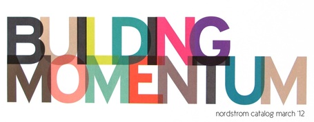
I got the Nordstrom catalog in the mail this week. Talk about inspiration! I love that color is in season! (I am a color gal. Case in point: I only own one black shirt and no white shirts at all.) Plus you don't have to spend a million to get the spring look--Target has caught onto the trend and has tons of really cute colorful clothes, shoes, jewelry, dishes, etc. When I saw the above title in the Nordstrom catalog I loved it. I thought I would copy it by making a scrapbooking alpha and post it for y'all to download. It will eventually become part of a spring kit that I'm working on right now! There are full alpha sets for each of the 8 colors. I hate it when designers do multicolored alphas, but don't include all colors for each letter so I usually get two letters in the title that are the same color and next to each other. No problems with that here. Also remember to subscribe to email updates so you don't miss a freebie! Check back in on Monday for layout inspiration!
_Download the alpha sets here. _Download the font used to create the alphas here. Thank you Fontfabric for free CU fonts ! 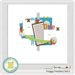 I also just discovered that Scrap Orchard puts new free templates up each week on their blog. This is this week's free template. Perfect for when you are stuck in a scrapbooking rut.
I'm slowly figuring out this blogging world. You can now subscribe to email updates for posts blogged on elle designs. Never miss a post! Just enter your email address in the box on the sidebar.
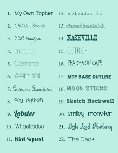
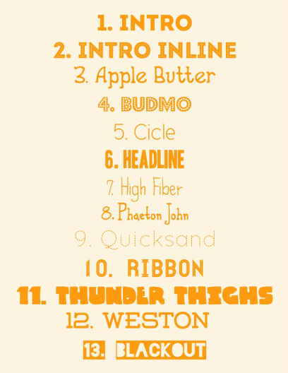
Everybody's writing about their favorite fonts these days, so I thought I'd join the crowd. Since I started the blog, I've found even more fonts that I love. So you have part 1 and part 2. Part 1: find the links herePart 2: Links are listed below
Links: 1, 2, 3, 4, 5, 6, 7, 8, 9, 10, 11, 12, 13
|


