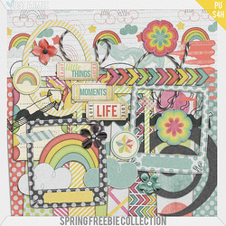
Not much in the way of freebies today. But I read in the Scrap Orchard newsletter that iNSD, or National Scrapbooking Day, is coming up soon! i.e. LOTS of freebies and sales! I googled it and it is the first Saturday in May. Yes! I thought I would miss it because we are moving, but I'll still have a couple of days to download all of the goodies. Right now the Lilypad, one of my favorite stores, is having a storewide 30% off sale. Not great considering their kits are very expensive, but they rarely have sales better than that, so I would go for it if you have something on your wishlist there. Since there weren't any good freebies out today, I made my own for you. I wanted to have the Easter kit done by now, but that didn't happen, so today you get a quickpage and a template using the kit.
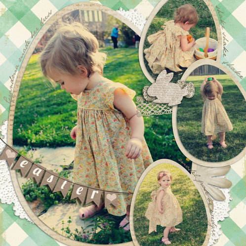
the page I did with it
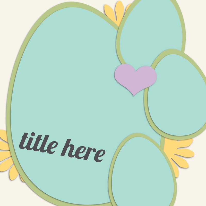
the template
|
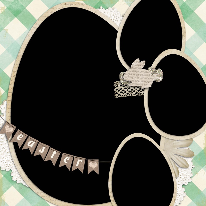
the quickpage
| Download link for the Quickpage and Template: click here**Remember to send me your layouts to post to the gallery**
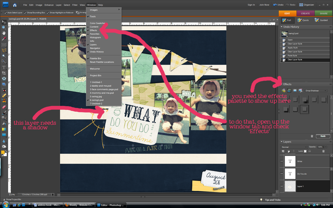
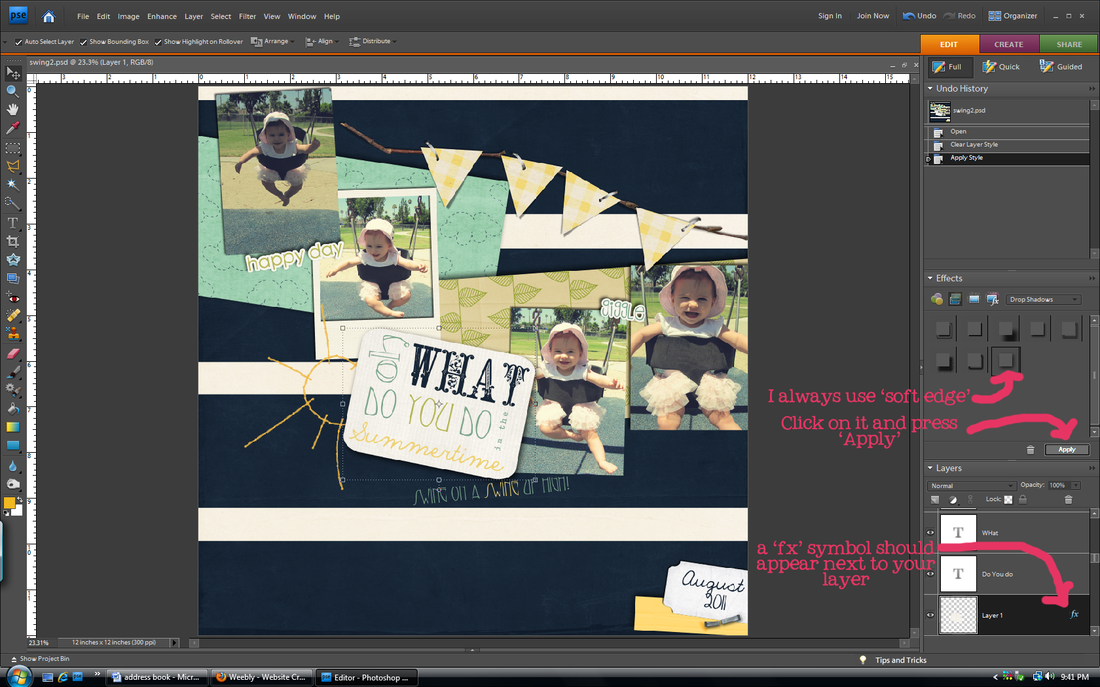
This is part two of the drop shadow tutorials. Make sure you understand the basics first (find that tutorial here). Today's tutorial will be about warping shadows. Sometimes I get jealous of real Photoshop users because they can do so much more with shadows, like warp them. When you look at shadows in real life, the shadow usually doesn't follow the edge evenly on all sides. But that is the only option you have on PSE, even after altering. That is okay on most things, but sometimes you need to do more with things like strings that don't lay perfectly flat. To illustrate what I mean, look at my examples below (click to enlarge if you need to). Look at the blue string. With the regular shadow it looks flat. That's fine, but then look at the warped shadow. More realistic right? regular shadow
| warped shadow
|
I was going to do my own tutorial, but then I found this excellent one online. Why reinvent the wheel? Find the tutorial on how to warp shadows in PSE at the site below: http://scraporchard.com/forum/showthread.php/20732-Warping-Drop-Shadows-in-PSELet me know if you have any questions.
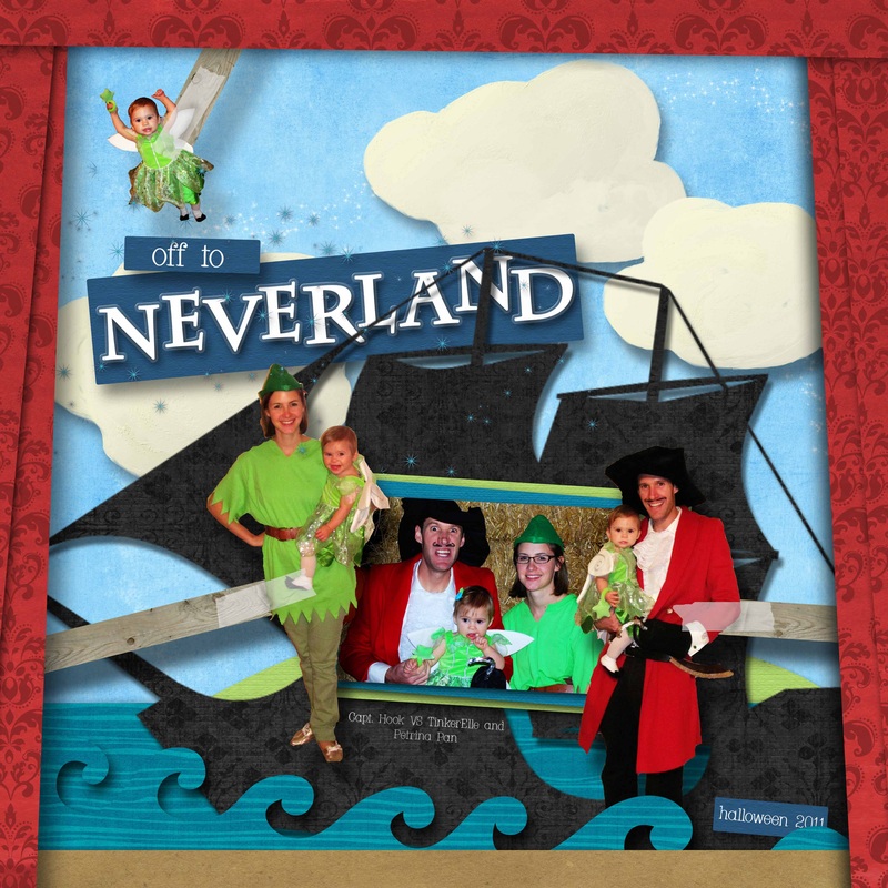
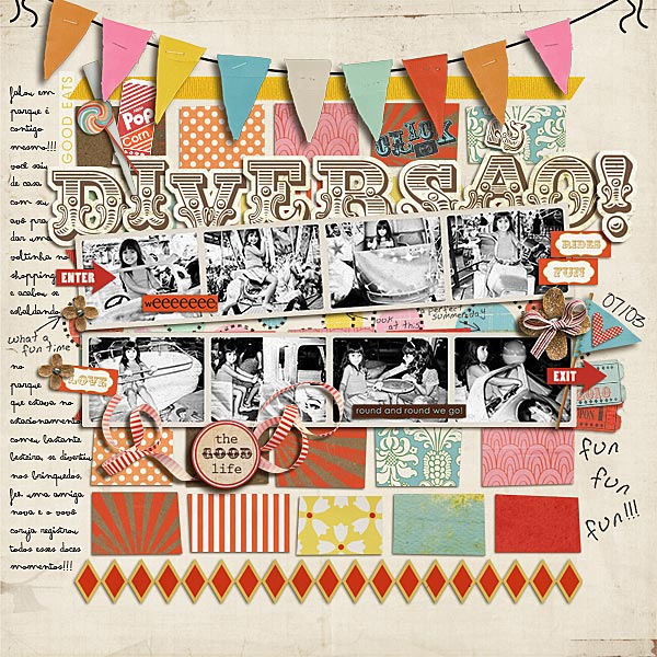
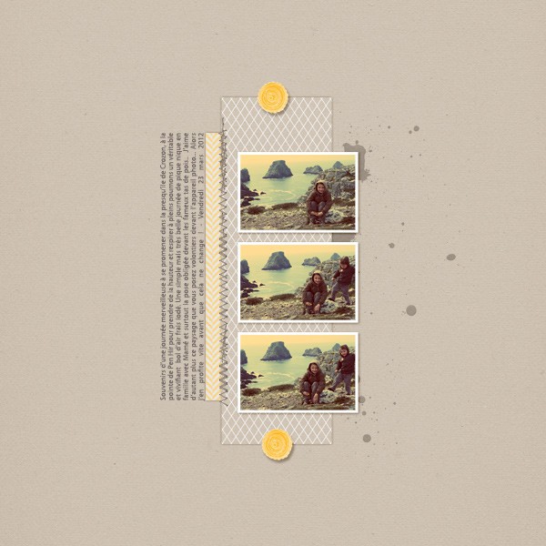
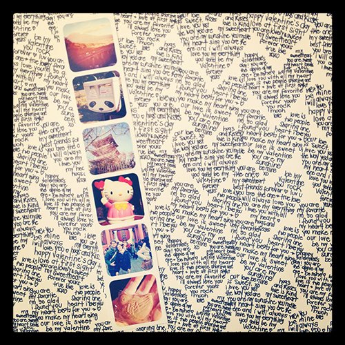
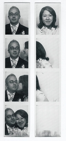
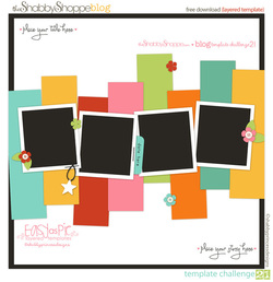
I'd like to think that I was the originator of the photobooth craze. I got the idea pre-pinterest, pre-me being on facebook, pre-blog, pre-scrapbooking six years ago as my fiance and I were standing in line for a movie. I saw a photobooth next to us in the theater and I had the brillant idea to do photobooth pictures for our engagement pictures to be sent out with the invitations. Now it isn't such a novel idea because everyone who is anyone has a photobooth at their reception, but I still like to believe I was the first. ;) Photo strips are easy ways to incorporate lots of photos onto one page. Especially if you have kids like me and you end up taking a bagillion pictures in a row to capture movement and smiles and then end up using all of them because gosh dang it, your kid is the cutest kid EVER. There are lots of things for sale to help you out, but you can always create your own using my how to create your own template tutorial. Click on the photos below to see the original link.
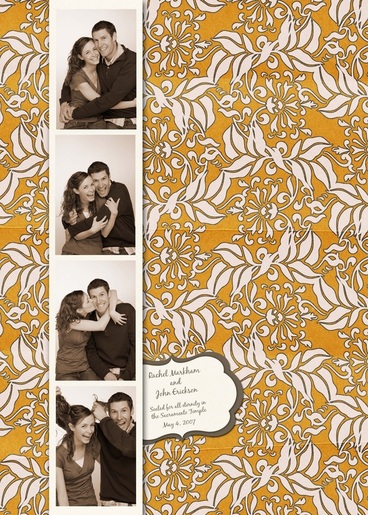
proof. the strip was included in the invitation sent out for our wedding. Need to do a better page with it.
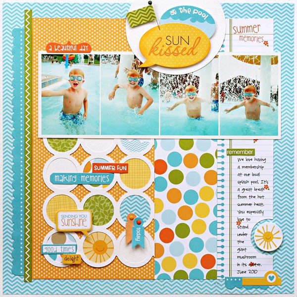
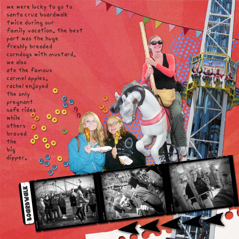
strips used to show action
minimalist but cute. I saved this one a long time ago too. don't know where it is from. oscraps??
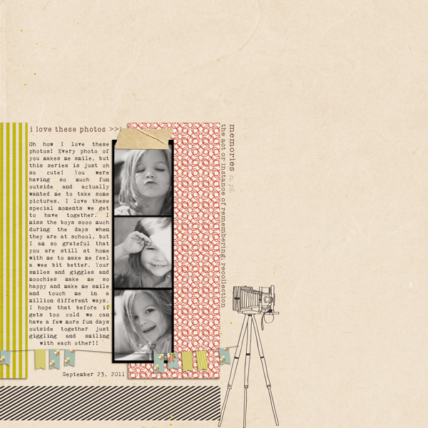
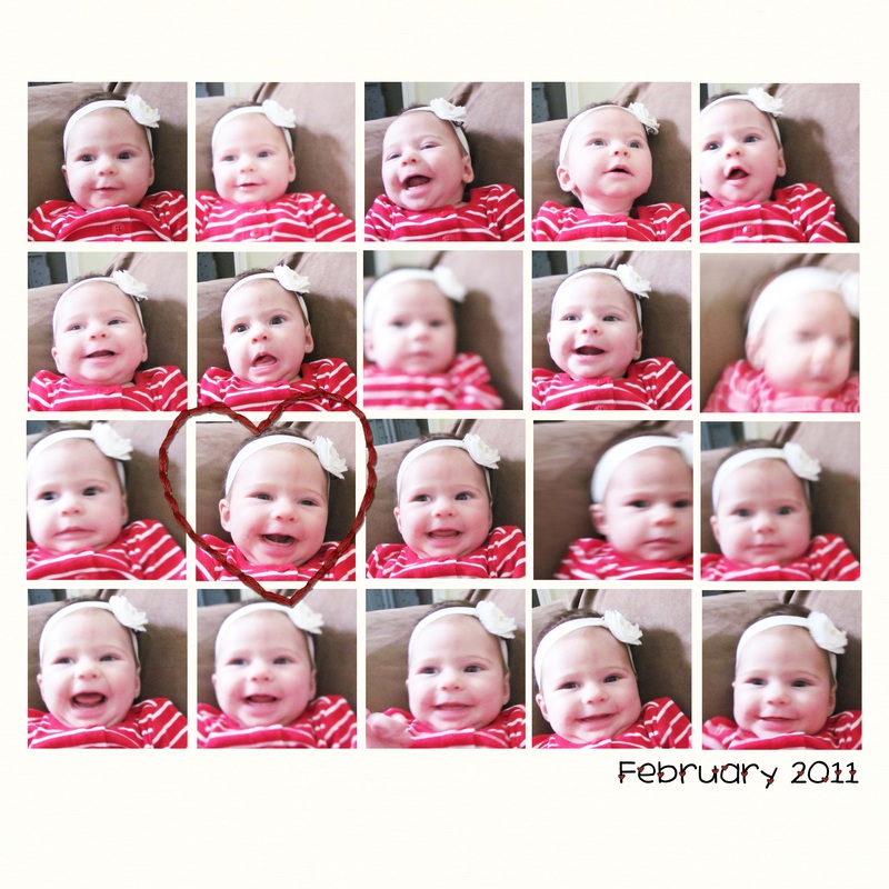
use photo strips as a block to show facial expression change
I don't like her frames, they are too simple and boring compared to the excellence that is the rest of the page. I would have done them in a different color. But I like her strip placement.
I can't find the link for this one. I saved it a long time ago. I love it for so many reasons-the title behind, the color, the banner, the cut out blocks...
another one of mine. you can use strips as part of a collage
sahlin studio just put these for sale. may be worth buying when they go on sale
|
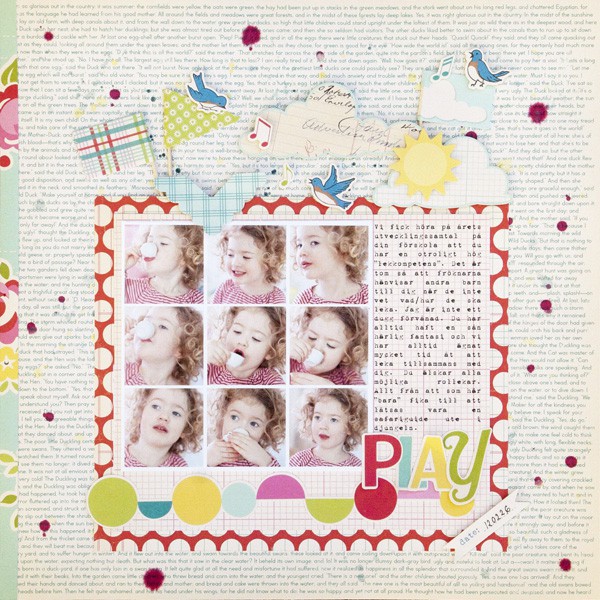
when you need to use lots of pictures without it looking too cluttered
the minimalist look-love the broken up photos that slightly change
this is mine, an example of photo strips in block form. see, I have a problem cutting photos
don't love the colors or kit from this page, but the photo strips are funny and well placed
this {yawn] boring one is mine. I like the strip, but that's pretty much it. I think I'm going to split the text and move the strip down the page.
don't like the background paper, but I like the emphasis on the strip
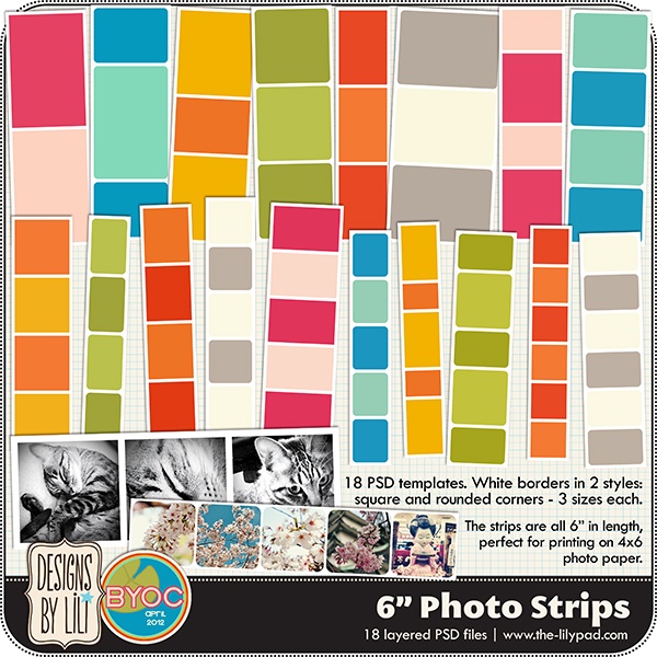
these were just put up for sale. easy to copy. hint, hint.
|
creative
other inspiring news...
Sweet Shoppe Designs is doing a wonderful thing on Pinterest! They are posting inspiring ideas for layouts and then giving you points for completing layouts from that inspiration. Read here for more details. And visit the pinterest board here. Perfect for when you have scrapbooker's block (like writer's block) even if you don't want to do it for points.
Sorry for the absence. I was spending time with family that came into town for Easter. As a warning, posts may be scarce in the next two months because life will be a little crazy with vacations, graduation, and moving across the country yet again (fourth move this year). I'll be back later with some Monday Muse inspiration!
 Sweet Shoppe Designs added new designers to their team. Each designer has posted a free mini kit or template for you to have. There are 24 FREEBIES ON THE PAGE!!!! Go here to see them all.
 Just Jamie free kit and solid papers. Go here.
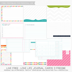 Miss Tiina free journal cards. Go here.
 Free templates at Shabby Princess-Don't forget that they give out around 3 a month! Go here.
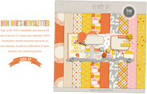
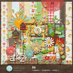 SIGN UP FOR NEWSLETTERS! Scrapbook shops and designers have newsletters that usually give out free things. Like Cat Scrap gave away this free kit in their newsletter. Go here to sign up for the newsletter. I think you may be too late for this month's freebie, but you will get next month's!
 Scrap Orchard also gives out free kits once a month, broken up over each week. This is this month's kit. Go here to sign up for the newsletter.
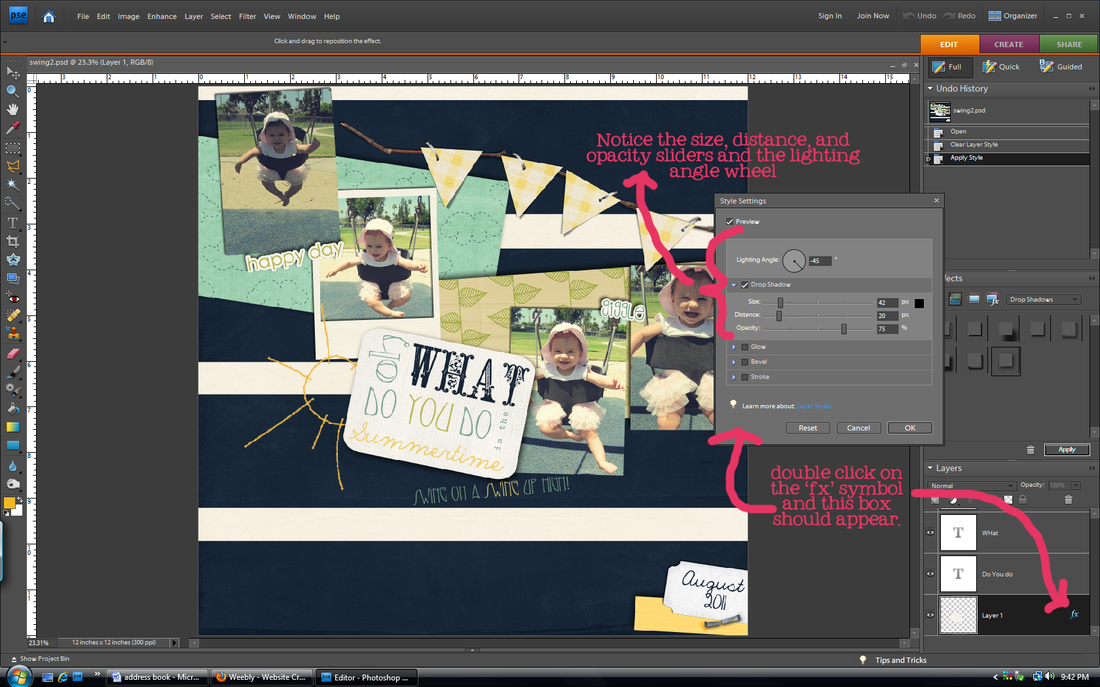
Drop shadows are key to taking a layout from looking computer-generated to looking like you made it with actual paper supplies. They add depth and realism. In order to achieve that realistic look, you have to venture out of the default drop shadow setting. I promise it is easy. (side note: I use Photoshop Elements, but in Photoshop CS you can do more things with shadows to make them look realistic like warp them and choose the blend mode. Sadly I cannot, so this tutorial will not include changing those settings)
no shadows
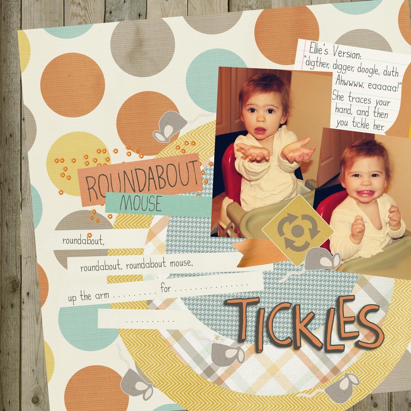
This has no shadows (except for the "tickles" whose shadow was saved permanently, oops). See how flat it looks?
| default shadows
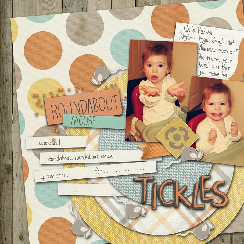
With default shadows, everything seems to be 'floating' on top of each other instead of layered. Open this up larger to really see the difference between this and altered shadows.
| altered shadows

This looks a little more realistic. The photos and papers look like they are 'resting' on top of the other layers rather than 'floating' in space.
|
tips
1. These are the things you can change in Photoshop Elements:
Lighting Angle- changes the angle of light and
therefore the angle of your shadow
Size- changes the size of your shadow, not to be
confused with the distance. The size will
make your shadow softer or harder on
the edges. Small size=hard edge
Distance- changes how far away your shadow
is from the layer underneath
Opacity- changes how dark the shadow is
2. Vary your shadows for different objects. A button makes a larger shadow than a piece of paper or a photo. Sahlin Studio recommends the settings listed below. That's too much for me to memorize so I usually just play with the sliders until I am happy with the result.
Flat Paper/photos: distance 14/size 20
Stacked Paper/photos: distance 20/size 21
Flat Ribbons/strings: distance 33/ size 35
Ribbons/strings: distance 46/ size 49
Flowers: distance 46/ size 49
Stitches/staples: distance 7/ size 12
3. The closer an object is to the layer below, the darker the shadow will be because less light gets to it. For example, a paper sits closer to the background than a flower, so it would have a darker shadow.
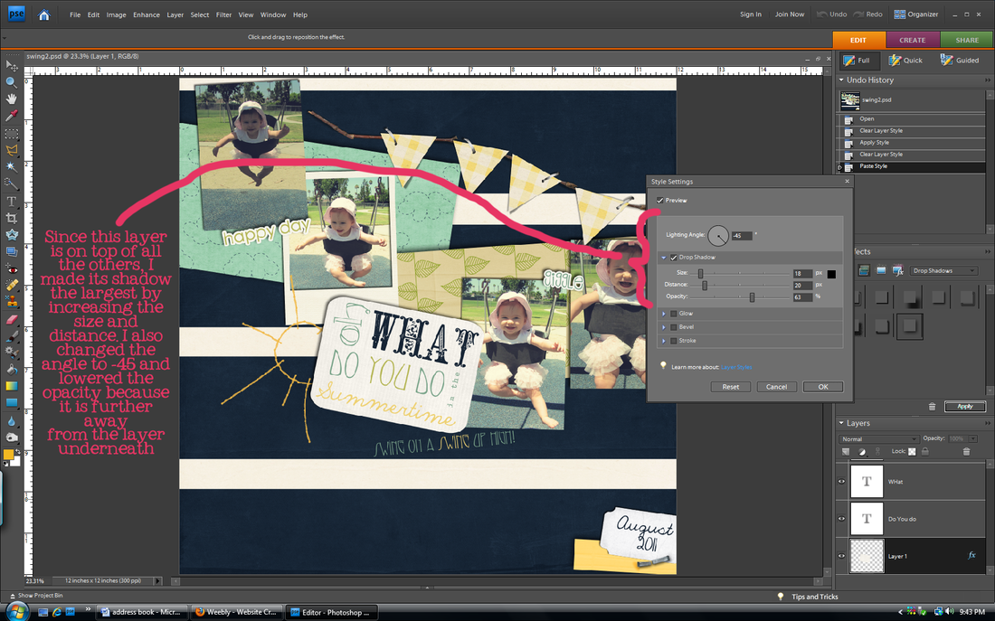
4. Change the angle of the shadow. Most people use the default 120 degrees, but I think that 45 degrees or -45 degrees looks more striking. Some of my pages use 120 degrees, some 45, some -53. I like to live on the wild side, always changing.
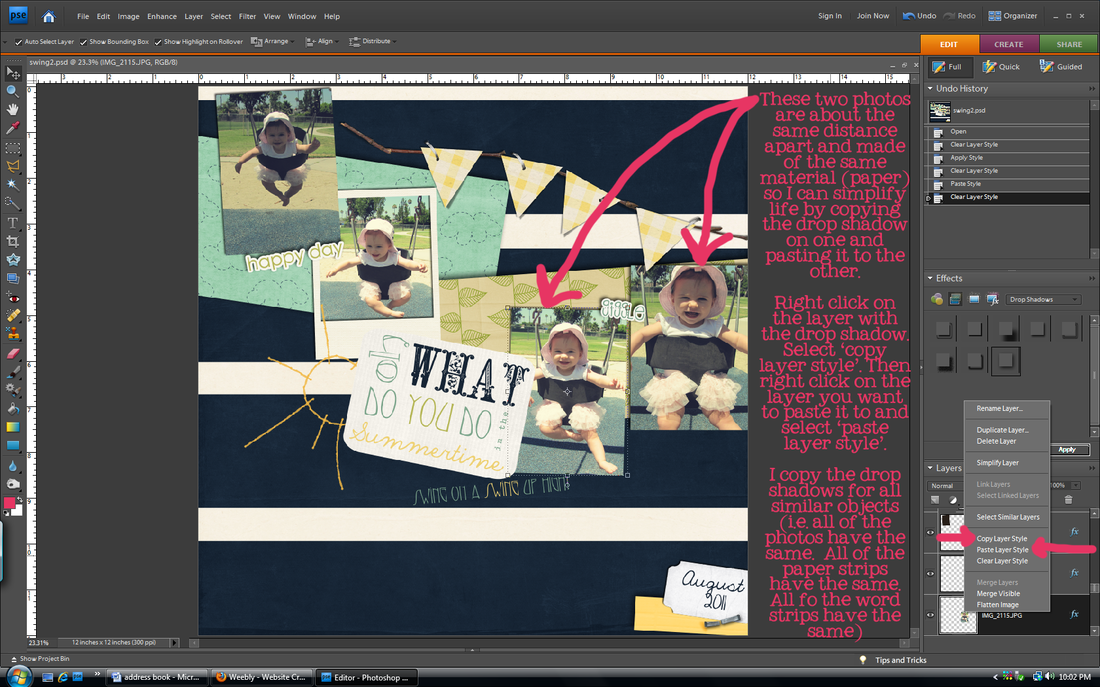
5. Once you get a shadow that you like, you can right click on that layer and 'copy layer style'. Then you can paste that layer style on any layer that you want to have the same shadow as that one. Just right click on the layer you want to paste it to and click 'paste layer style'. My friend Brittany just barely showed me this, and it is a life saver! I used to go through each layer one by one to fix the shadows! (I showed how to do this in the last step of the tutorial below)
6. Many times designers will pre-shadow templates for you. When replacing a shape with an actual element, use the method in tip #4 to copy that element's layer style before deleting it and replacing it with your own so that you can paste that layer style to your actual element.
drop shadow basics.
in other news...
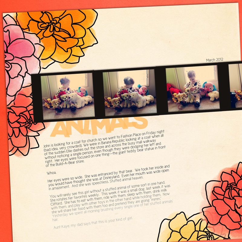
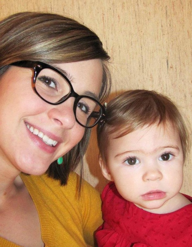
 Wahoo for our first guest gallery poster! Ashley submitted her layout using the Color Me Spring kit. Didn't it turn out cute? Her daughter is adorable! Send me your layouts at [email protected]. You know you want to. It doesn't have to be using my stuff, just layouts that you think would inspire others. If you do submit something using another designer's kits/elements/fonts just include the credits.
Here are freebies I found. It's hard to list all of them throughout the week, so be sure to follow my new board on pinterest called Scrapbook Freebies (click on that for the link). I'll put all of my findings there and then highlight my favorites here on Friday. 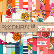 First (and best ;) ) of all, don't forget to download my latest free kit from Wednesday. Find it under the My Freebies tab.
 Brittany helped me find these two amazing kits (only one is pictured)! I've used the yellow and gray one for tons of things. Find it here.
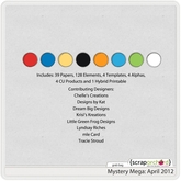 Scrap Orchard is celebrating a birthday so they are having a 35% off sale. Check them out because some of my favorite designers have products there. Usually I think they are overpriced, but with the sale, you can get things for a good deal! One of their best deals is their mystery mega. They don't show you the whole kit, but they do show you the colors (pictured left) and pages people have made with it. This kit looks Disney themed, and I know we all love Disney. Check it out because it is only $4!!!!
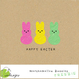 Cute peeps stamps! Download here.
 I love these even though I have no idea what I will do with them yet.
That's it for now. Have to run, but follow my pinterest board for all the latest freebies!
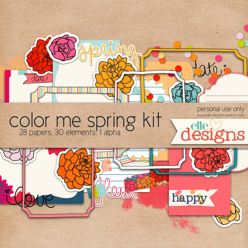
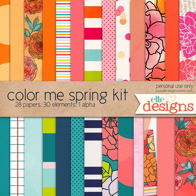
Today is not Friday, but it is a very special day. My mom's birthday! She the person to whom I credit my love for all things color and design. She definitely has an eye for both. And a closet full of red shoes. What can I say? Color is our weakness. This kit is inspired by and dedicated to my wonderful mom.  I also got inspiration from the photo below found on pinterest. Isn't it beautiful? I'm sorry but I can't seem to find the original artist. Anyone know? color me spring kit
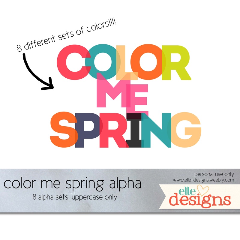
And here's the kit. I went overboard on the papers, but with this color palette, I couldn't stop! The alpha was released a few weeks ago, so if you already downloaded it, don't download it again.
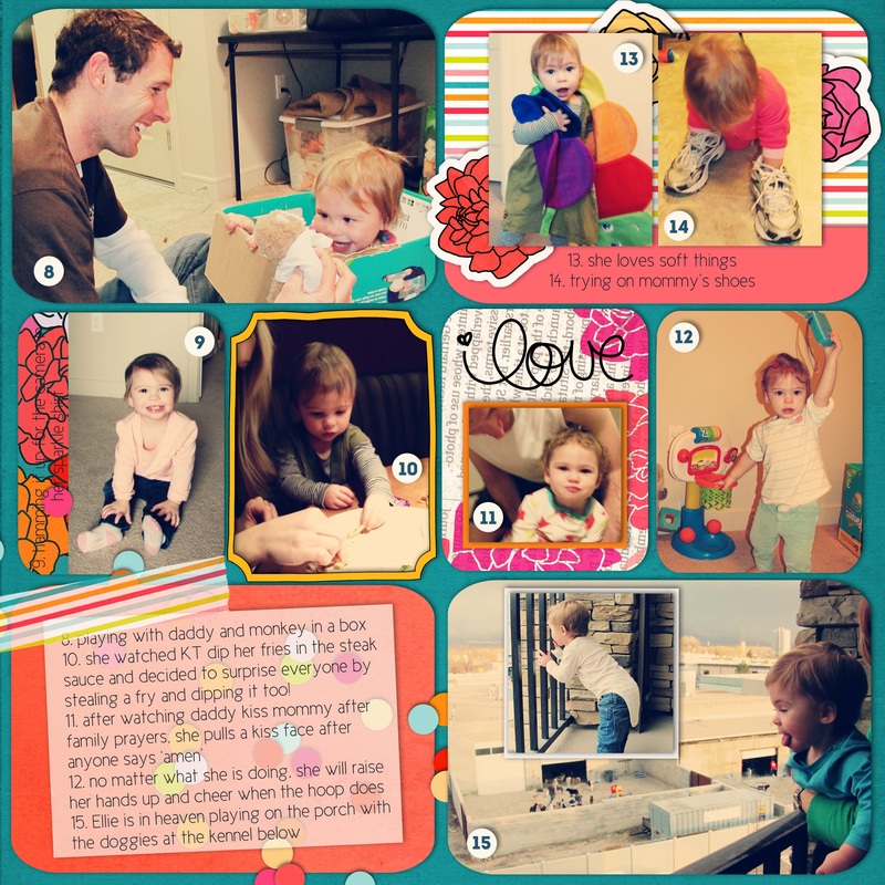
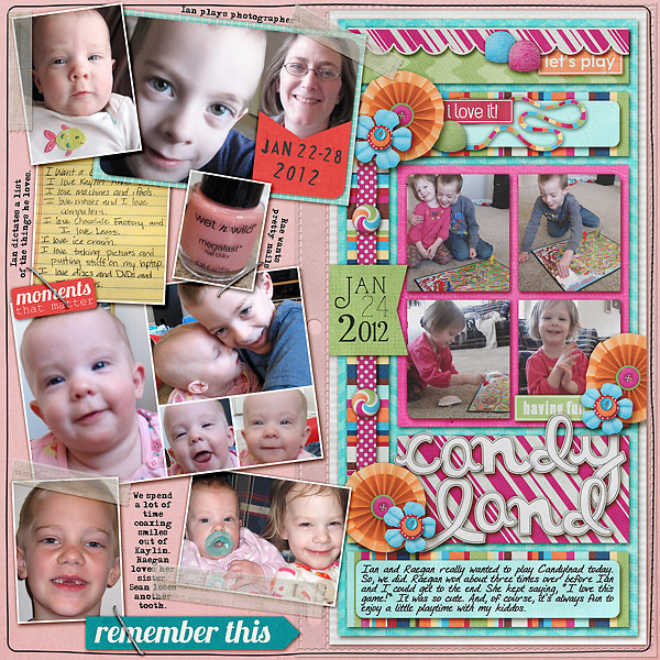
These are pages that I scrapped with the kit. Notice the inspiration from Monday? Please leave a comment and let me know what you think of the new kit!
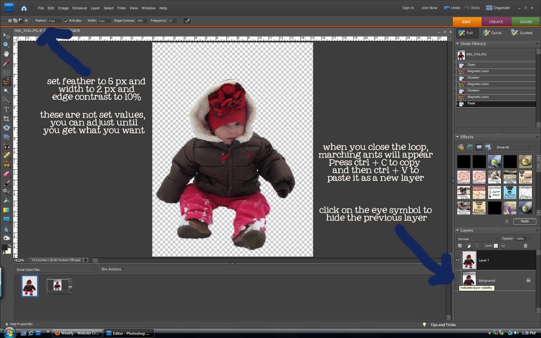
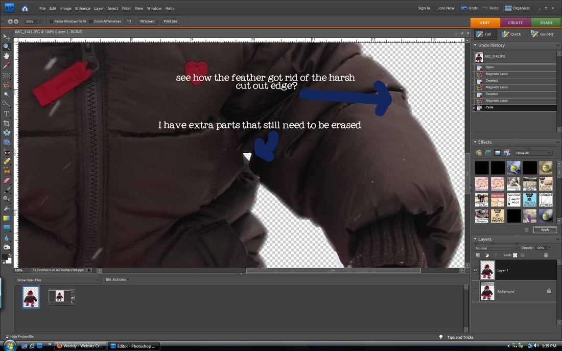
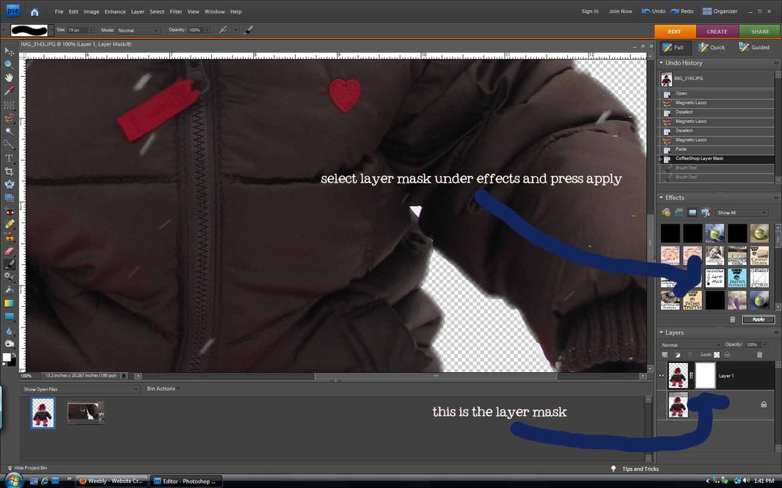
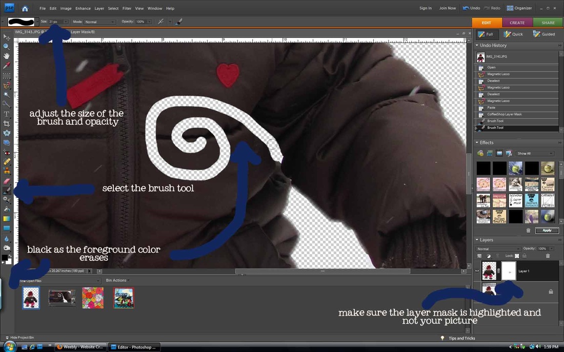
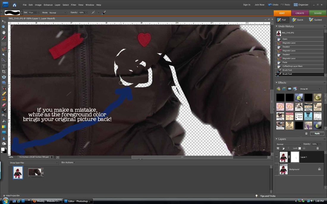
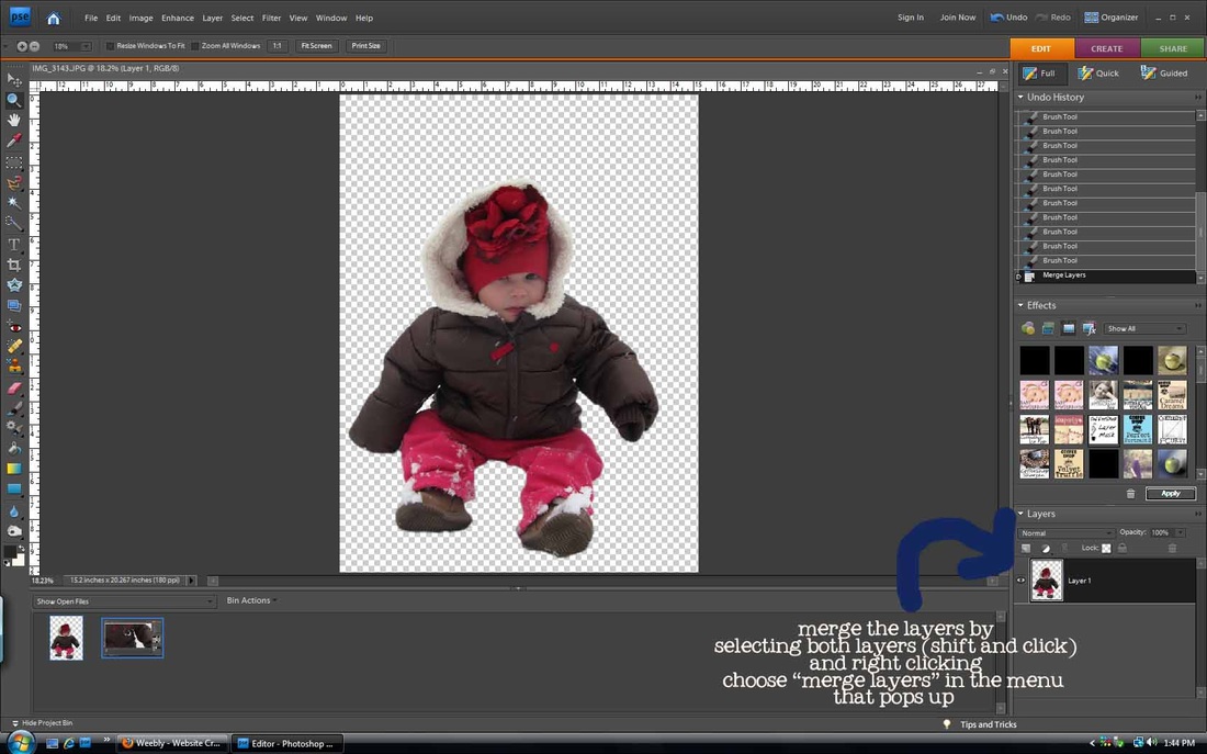
I love the magnetic lasso tool. It is so smart! It will trace along an object in your picture so you can cut it out. It isn't perfect and takes some practice, but it is lots of fun. Especially if you want to doctor pictures :). This method works best on pictures where there is high contrast between the object and the background (that's how the lasso senses where to trace). You can always fix errors by closing the loop and pressing ctrl+D to deselect the marching ants to start over. You can also cover up mistakes by using a layer mask. I used to erase the extras on my pictures, but if you erase too much, too bad, so sorry, it's gone forever. With layer masks, that is not the case. Photoshop Elements doesn't come with layer masks, but the Coffeeshop blog has created an action that will make one for you. You need to download and install the action before doing this tutorial (it's free and easy-she has detailed instructions on her site on how to install them. scroll down to see the download button). She also has wonderful photo actions that you can apply to your pictures to make them beautiful. cut outs using the magnetic lasso and layer masks
Make your corrections, and then move to the last step.
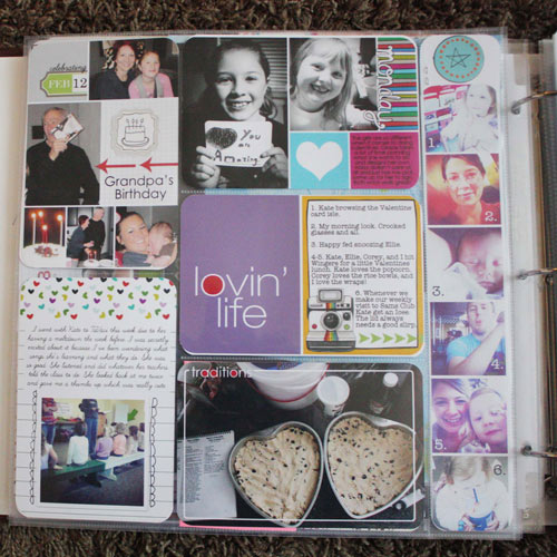
Here are two pages where I used this method. I'm not trying to be arrogant and boastful by posting the second page, it's just the only one where I used a large cut out picture. Let me know if you have questions!
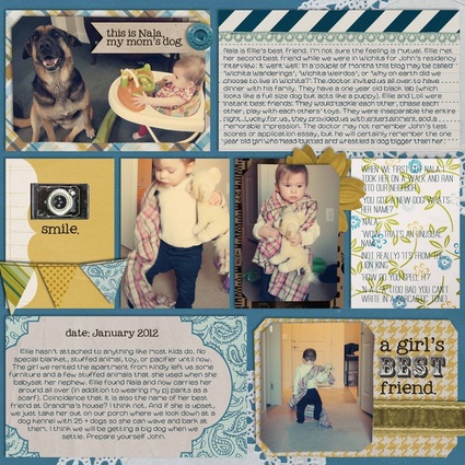
Project 365 people are crazy. One picture every day, two pages a week, for an entire year. It makes me hyperventilate just thinking about it. But as I was browsing through galleries of people's work, I realized that it could be kind of fun...kind of...if you could find the time. I figured that I write in a family journal every Sunday which I will print out eventually. Why not make it cute by including pictures and making it a Project 52? Well, Rachel, because it would be crazy...seriously CRAZY. Don't even think about it!
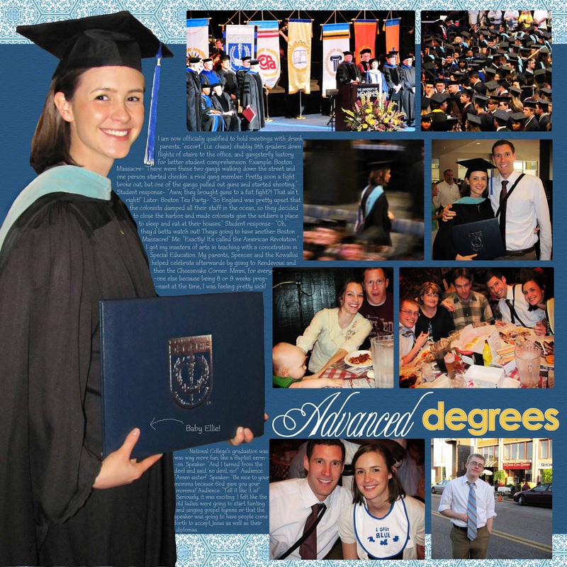
Anyways, what I really love about Project 365/52/24 layouts is that they include lots of writing and lots of pictures. And they still look cute. I always have the problem of having too many pictures and too much to say. These layouts give me inspiration, even if I'm just doing a Project 1 layout. Here are some I found today:
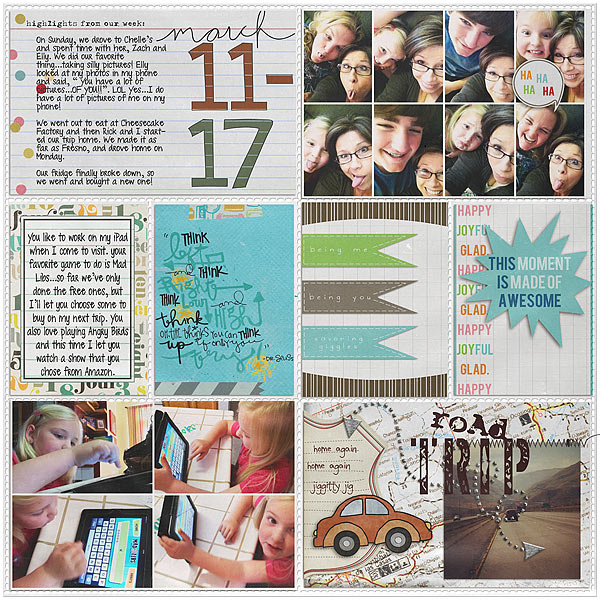
i love the candid shots grouped together at the top and the road trip combo
woah. she combined a clean style with a slightly messy style on the same page. and it works!
via
|
bright colors and clean
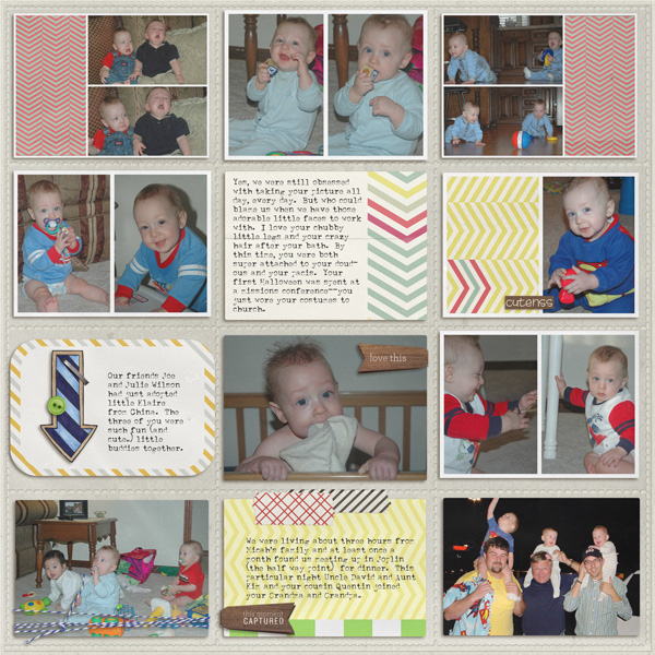
look at how many photos she fit on without it looking busy!!!! seriously, this will be my next baby book.
|
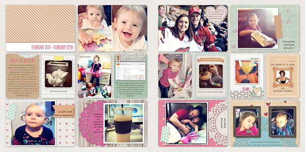
doilies, washi tape edges, clean style. love it
I hope that inspires you! And you don't have to put them in real or digital plastic dividers (although Valorie Wibbens makes really cute ones). Here's a layout I did copying a Project 365 type.
kit: jenn barrette's blue skies font: my own topher and the deck
Don't forget to get the freebies on Oscrap's birthday blog hop! Start at oscraps.com. Also, shabbyprincess.com/blog just came out with another cute 2 page monthly layout.
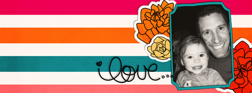
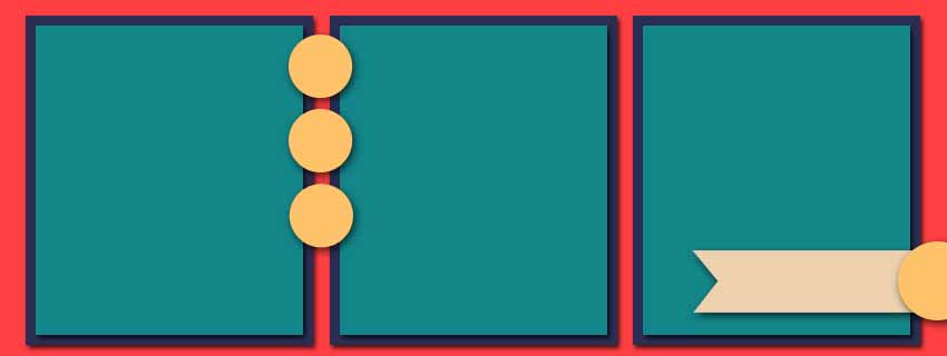
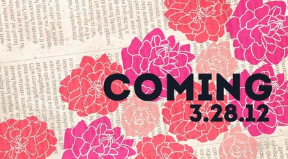
As you may know, Facebook will force everyone to change to the new timeline format this Wednesday, March 28. I'm not a fan (where is everything?), but since we have no choice, we can at least make the best of the changes. One of the new things is a huge place behind your profile picture to place a cover photo, kind of like the one at the top of this blog. Facebook sets it up as just a picture, but if you are like me and you don't have any nice-looking skinny horizontal photos, then you can always turn to Photoshop for help. Here's what I created.
I'm sure that with this new change, many digital scrapbook designers will be coming out with templates and quick pages to sell for people who can't or won't create their own. If you read Tuesday's post, then you already know how I feel about templates. Google "facebook timeline cover photo" to see what other creative people have already done. I'm sure many other good examples will surface soon. To get you through until you make your own or come up with the next clever idea, I have some templates for you to download. They are not fancy and not creative (I'm in a creativity rut). The point is to get you started and you can add whatever you want to them to make them cute.
Download the templates here. Be sure to check in next week when I put up my new spring kit!!!!!!!As far as other freebies go, Oscraps is celebrating a birthday starting this weekend. That means that they will be doing a blog hop (i.e. free stuff) starting Sunday and probably have good sales.
|